
It’s an exciting time to be a designer on iOS. My professional universe is trembling and rumbling with a deep sense of mystery. There’s a lot of rumors and whispers of a huge redesign coming to the iPhone’s operating system — one that is set to be 'the biggest in a long time'.
There’s only been one moment that was similar to this: the spring of 2013. On June 10th, Apple showed off what would be the greatest paradigm shift in user interface design ever: iOS 7. I remember exactly where I was and how I felt. It was a shock.
If there is indeed a big redesign happening this year, it’ll be consequential and impactful in many ways that will dwarf the iOS 7 overhaul for a multitude of reasons. The redesign is rumored to be comprehensive; a restyling of iOS, macOS, iPadOS, tvOS, watchOS and visionOS. In the intervening years between iOS 7’s announcement and today, iPhones have gone from simply a popular device to the single most important object in people’s lives. The design of iOS affected and inspired most things around, from the web to graphic design and any other computer interface.
That’s why I figured I'd take this moment of obscurity, this precious moment in time where its changes are still shrouded in fog to savor something: wholesale naivety of where things are going, so I can let my imagination run wild.
What would I do if I were Apple’s design team? What changes would I like to see, and what do I think is likely? Considering where technology is going, how do I think interface design should change to accommodate? Let’s take a look at what’s (or what could be) next.
Smart people study history to understand the future. If we were to categorize the epochs of iOS design, we could roughly separate them into the Shaded Age, the Adaptive Age, and the New Age.
The Shaded Age
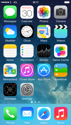
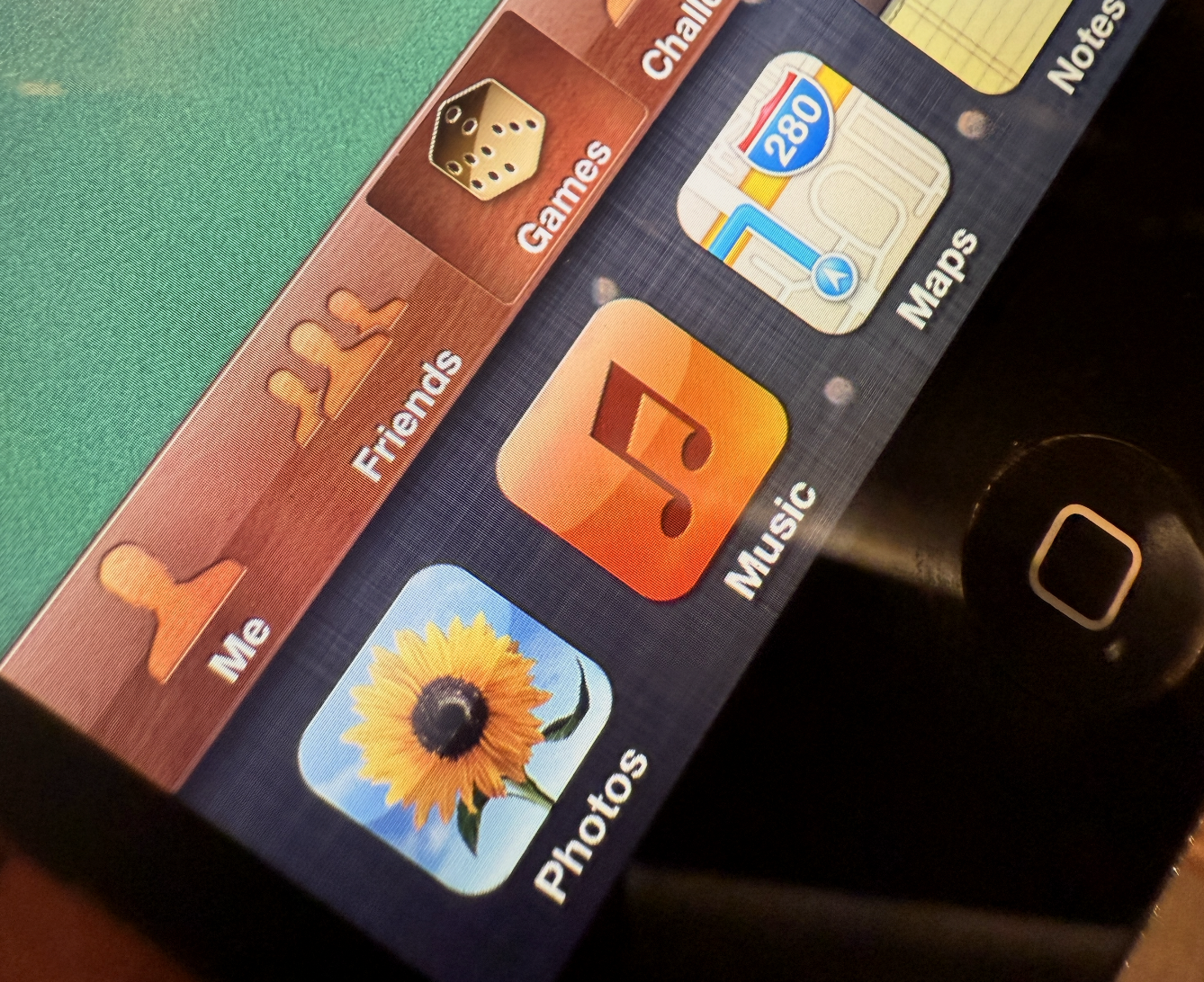
iOS started out as iPhone OS, an entirely new operating system that had very similar styling to the design language of the Mac OS X Tiger Dashboard feature:
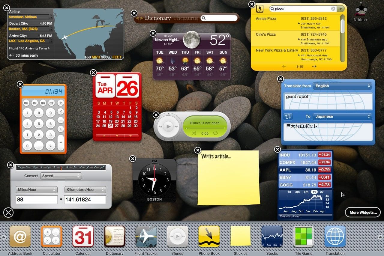
The icon layout on iPhone OS 1 was a clear skeuomorph.
You might’ve heard that word being thrown around. It might surprise you that that doesn’t mean it has lots of visual effects like gradients, gloss and shadows. It actually means that to make it easier for users to transition from something they were used to — in this case, phones typically being slabs with a grid of buttons on them — to what things had become — phones were all-screen, so they could show any kind of button or interface imaginable.
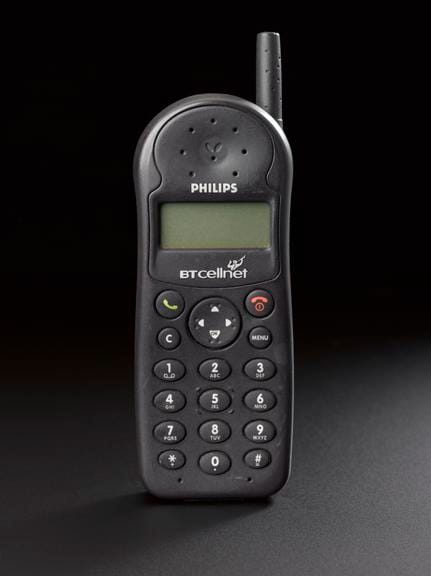
At the time of iPhone 1’s launch, a cartoon of a ‘phone’ would still be drawn as the image on the left. A grid of buttons defined its interaction model and comfort zone.
And yes, there was a whole lot of visual effects in user interfaces from iPhone OS 1 to iOS 6. In this age, we saw everything from detailed gradients and shadows in simple interface elements to realistically rendered reel-to-reel tape decks and microphones for audio apps.
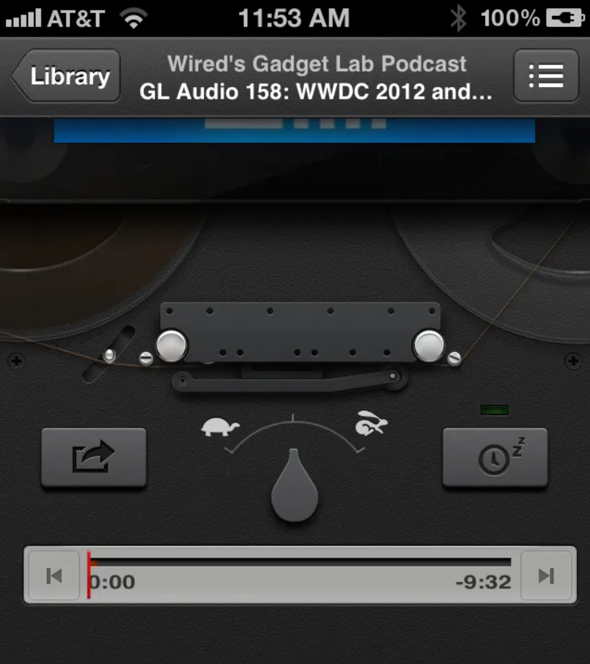
Having actually worked on some of the more fun manifestations of it during my time working at Apple, I can tell you from experience that the work we did in this era was heavily grounded in creating familiarity through thoughtful, extensive visual effects. We spent a lot of time in Photoshop drawing realistically shaded buttons, virtual wood, leather and more materials.
That became known as ‘skeuomorphic design’, which I find a bit of a misnomer, but the general idea stands.
Of course, the metal of the microphone was not, in fact, metal — it didn’t reflect anything like metal objects do. It never behaved like the object it mimicked. It was just an effect; a purely visual lacquer to help users understand the Voice Memos app worked like a microphone. The entire interface worked like this to be as approachable as possible.
Notably, this philosophy extended even to the smallest elements of the UI: buttons were styled to visually resemble a button by being convex and raised or recessed; disabled items often had reduced treatments to make them look less interactive. All of this was made to work with lots of static bitmap images.
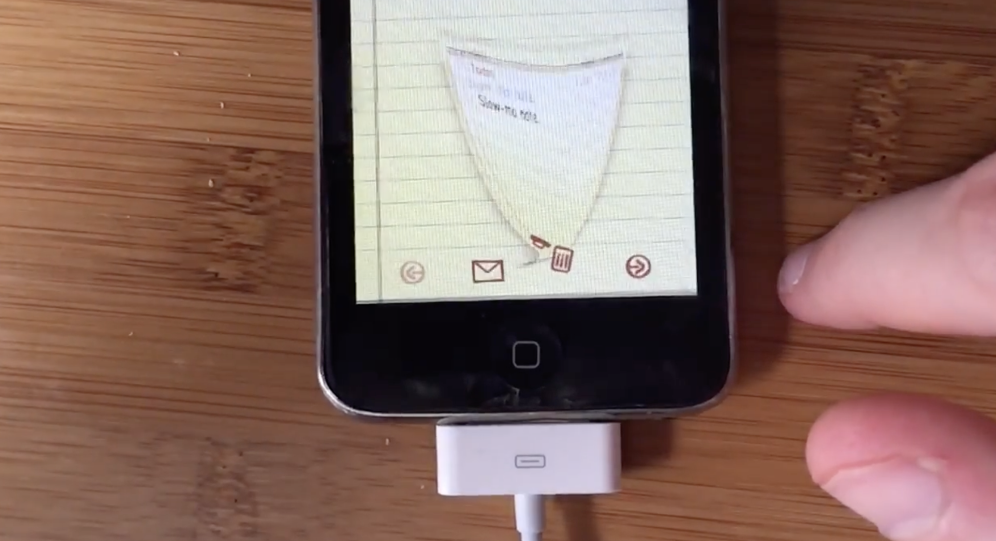
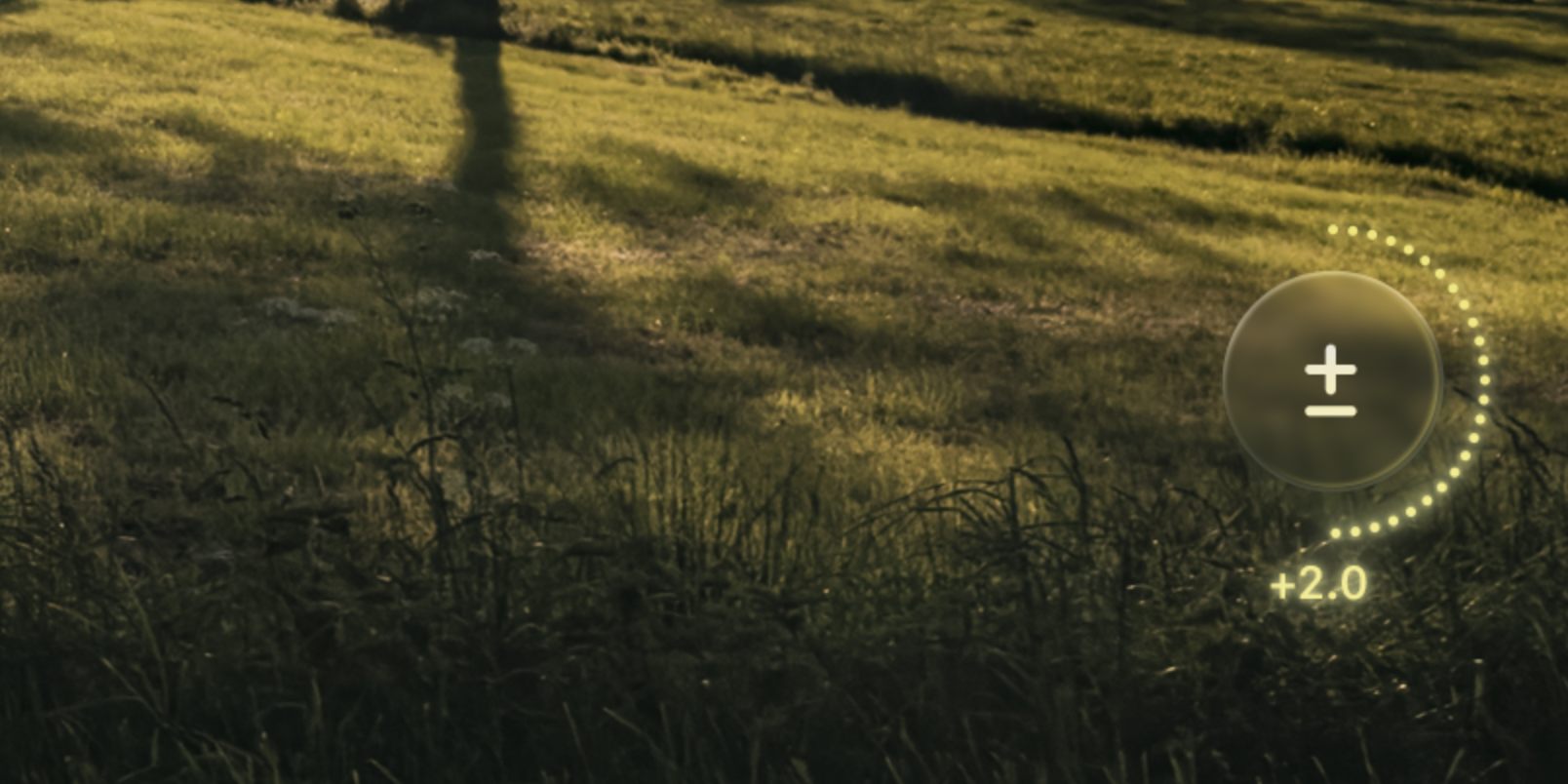
The first signs of something more dynamic did begin to show: on iPad, some metal sliders’ sheen could respond to the device orientation. Deleting a note or email did not simply make it vanish off-screen, but pulled it into a recycling bin icon that went as far as to open its lid and close it as the document got sucked in.
Our brand new, rich, retina-density (2×) screens were about to see a radical transformation in the way apps and information were presented, however...
The Flat Age
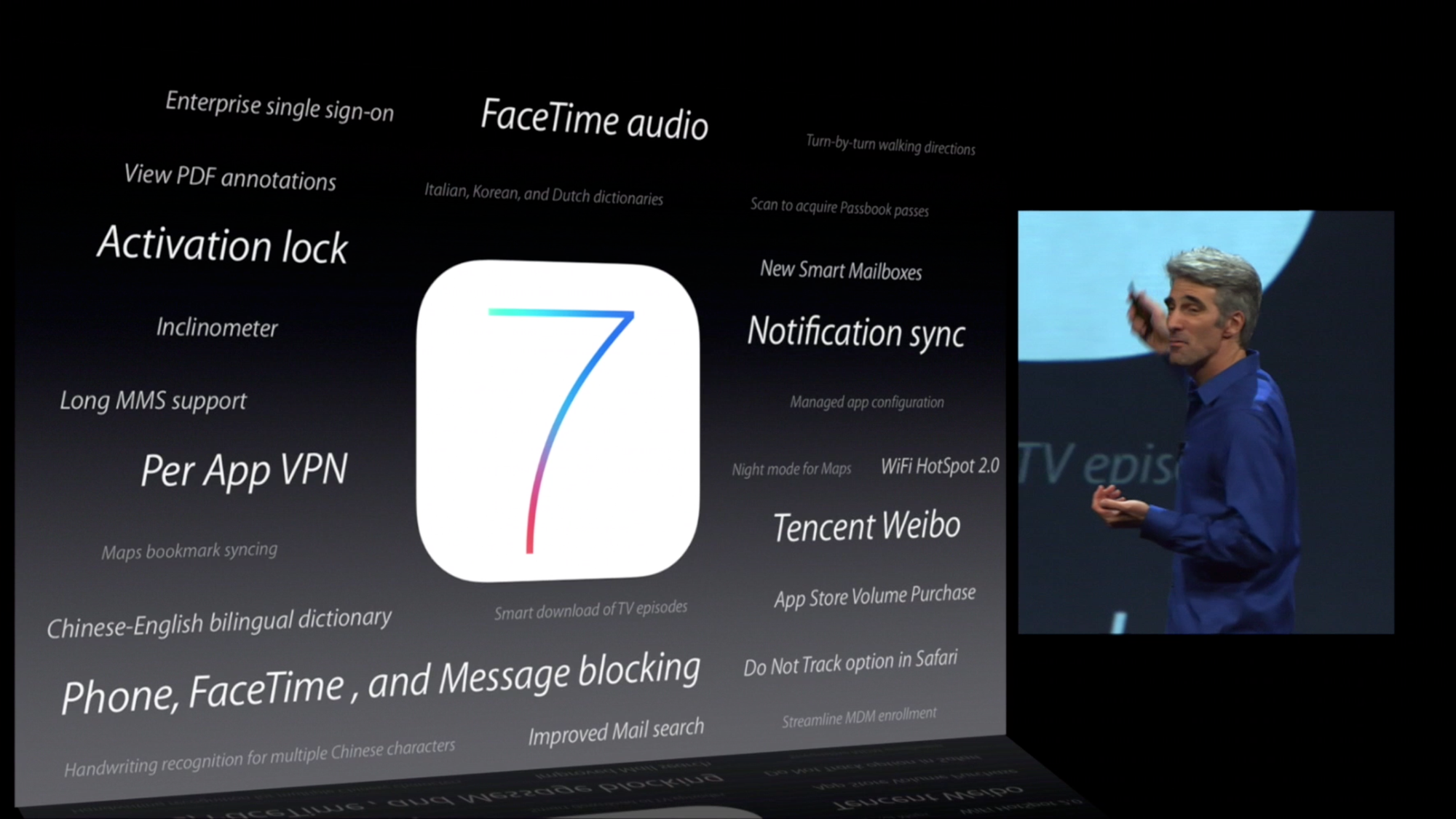
iOS 7 introduced an entirely new design language for iOS. Much was written on it at the time, and as with any dramatic change the emotions in the community ran quite high. I’ll leave my own opinions out of it (mostly), but whichever way you feel about it, you can’t deny it was a fundamental rethinking of visual treatment of iOS.
iOS 7 largely did away with visual effects for suggesting interactivity. It went back to quite possibly the most primitive method of suggesting interactivity on a computer: some ‘buttons’ were nothing more than blue text on a white background.
The styling of this age is often referred to as ‘flat design’. You can see why it is called that: even the buttons in the calculator app visually indicate no level of protuberance:
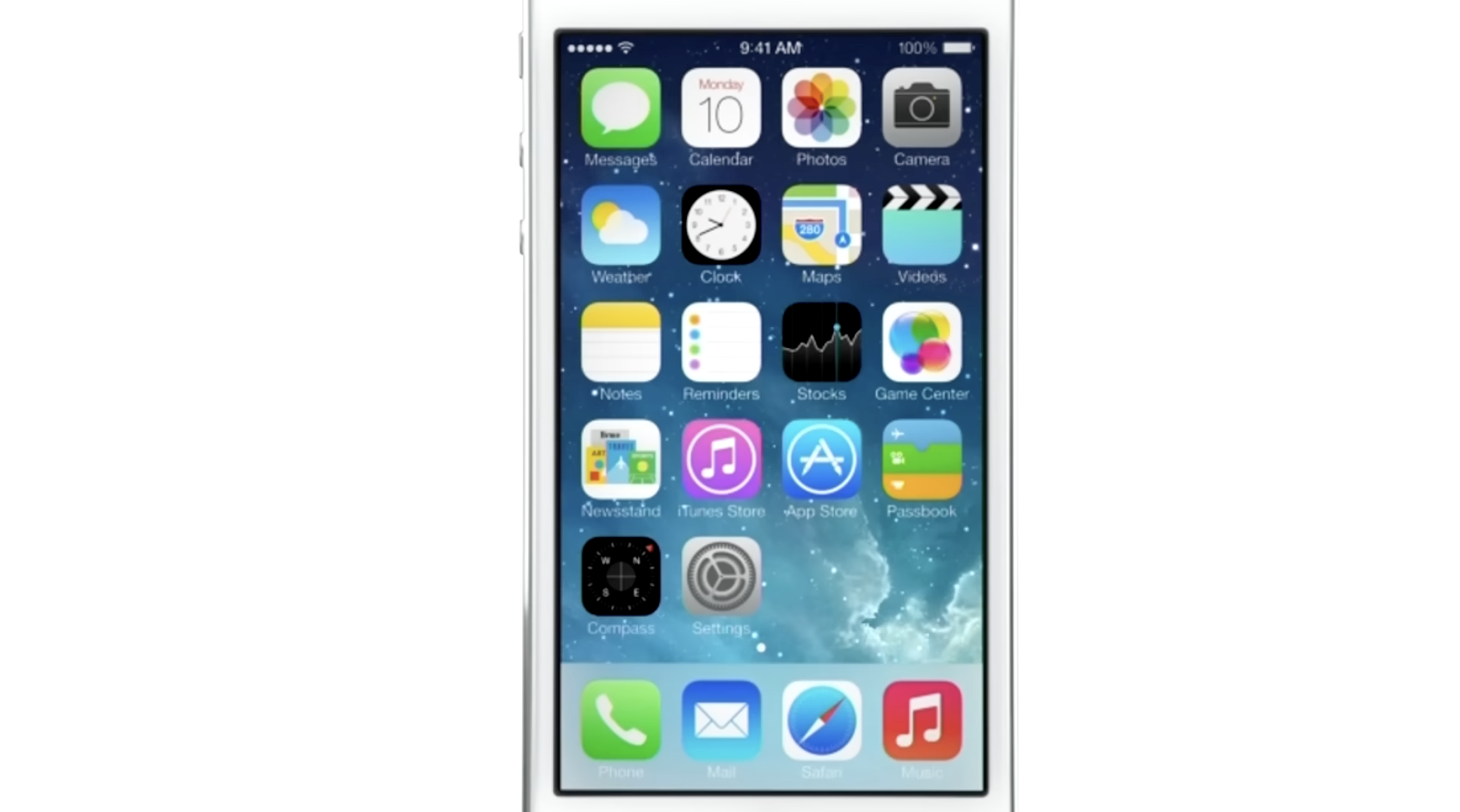
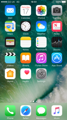
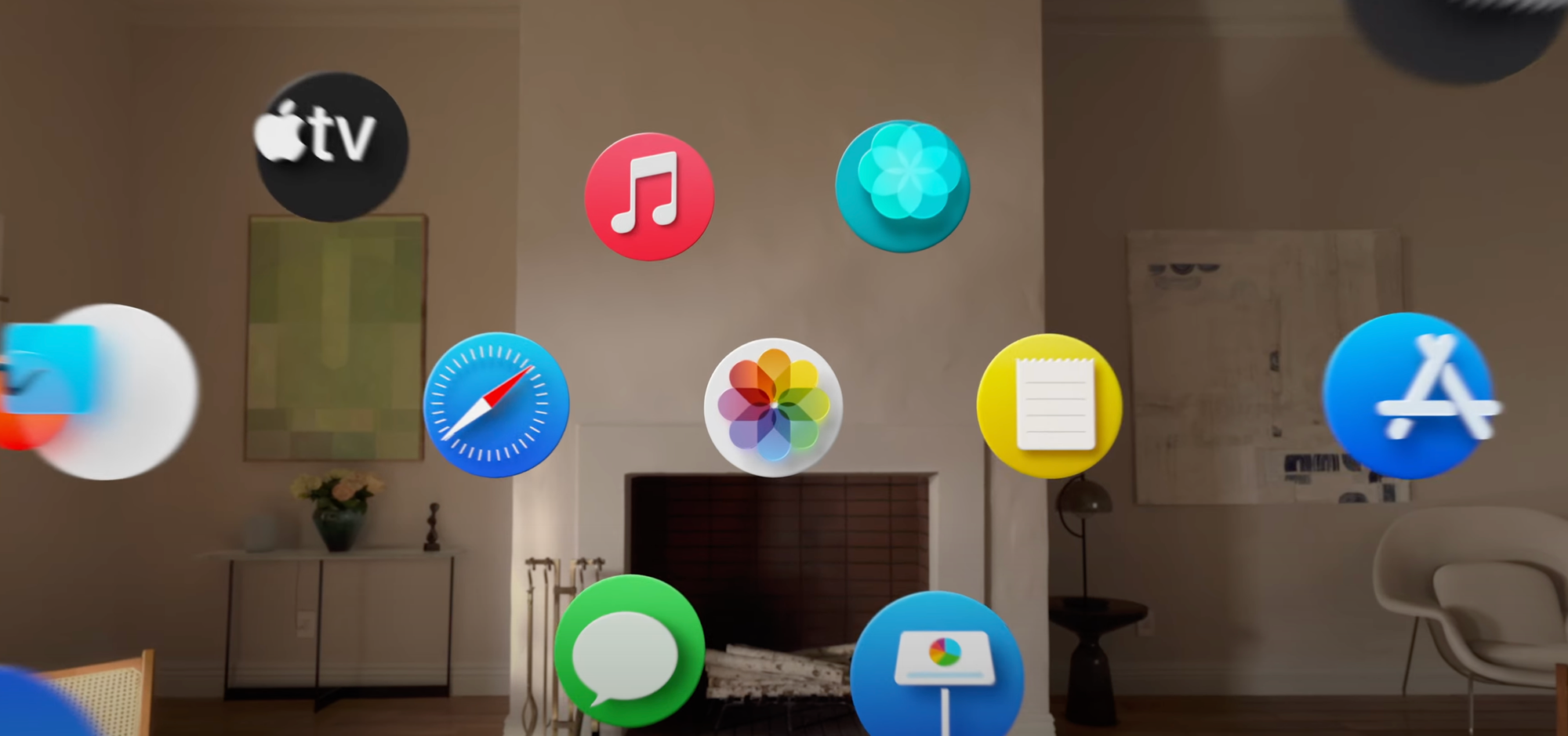
The Home Screen, once a clear reference to the buttons on phones of yesteryear, was now much more flat-looking — one part owing to simpler visual treatment but also a distinct lack of usage of shadows.
But why did shadows have to go? They had an important function in defining depth in the interface, after all. Looking at the screenshot above actually does it no justice: the new iOS 7 home screen was anything but flat. The reason was that the shadows were static.
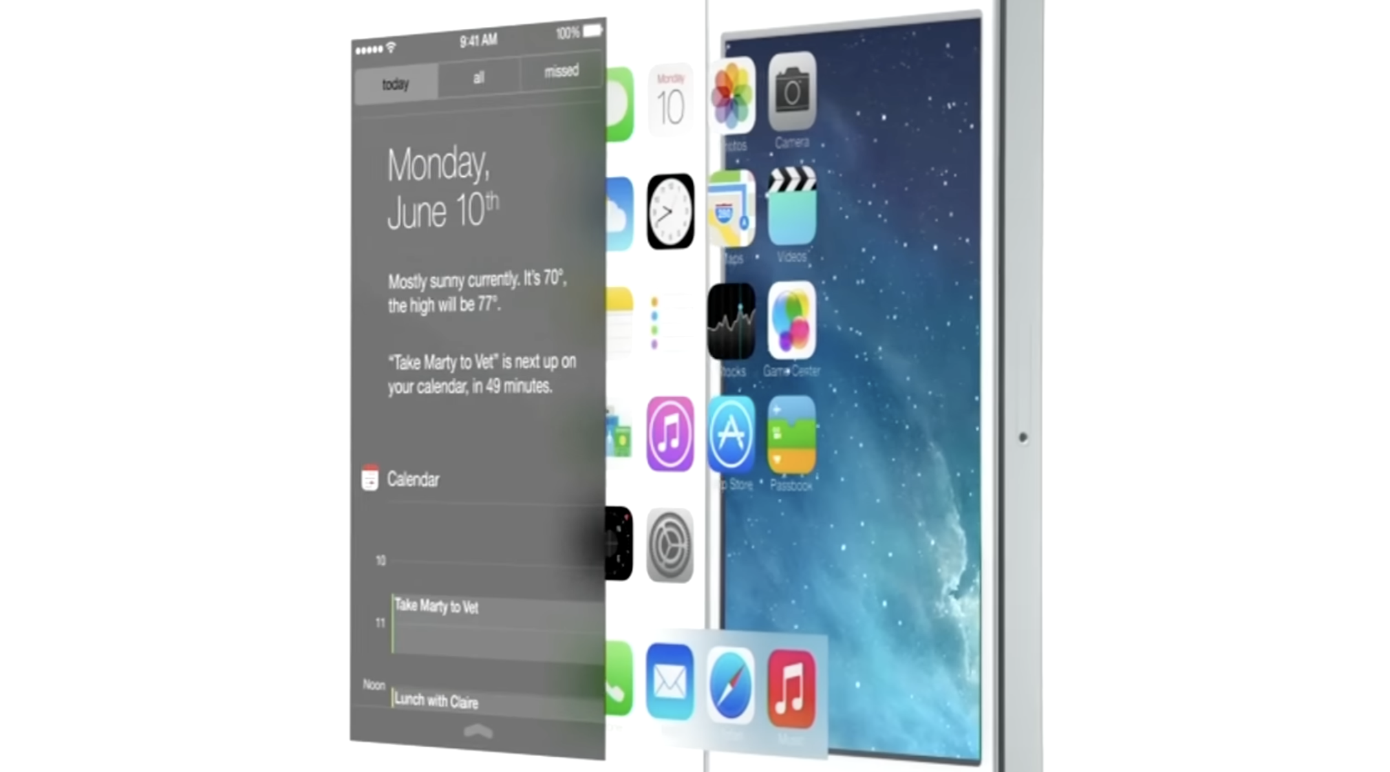
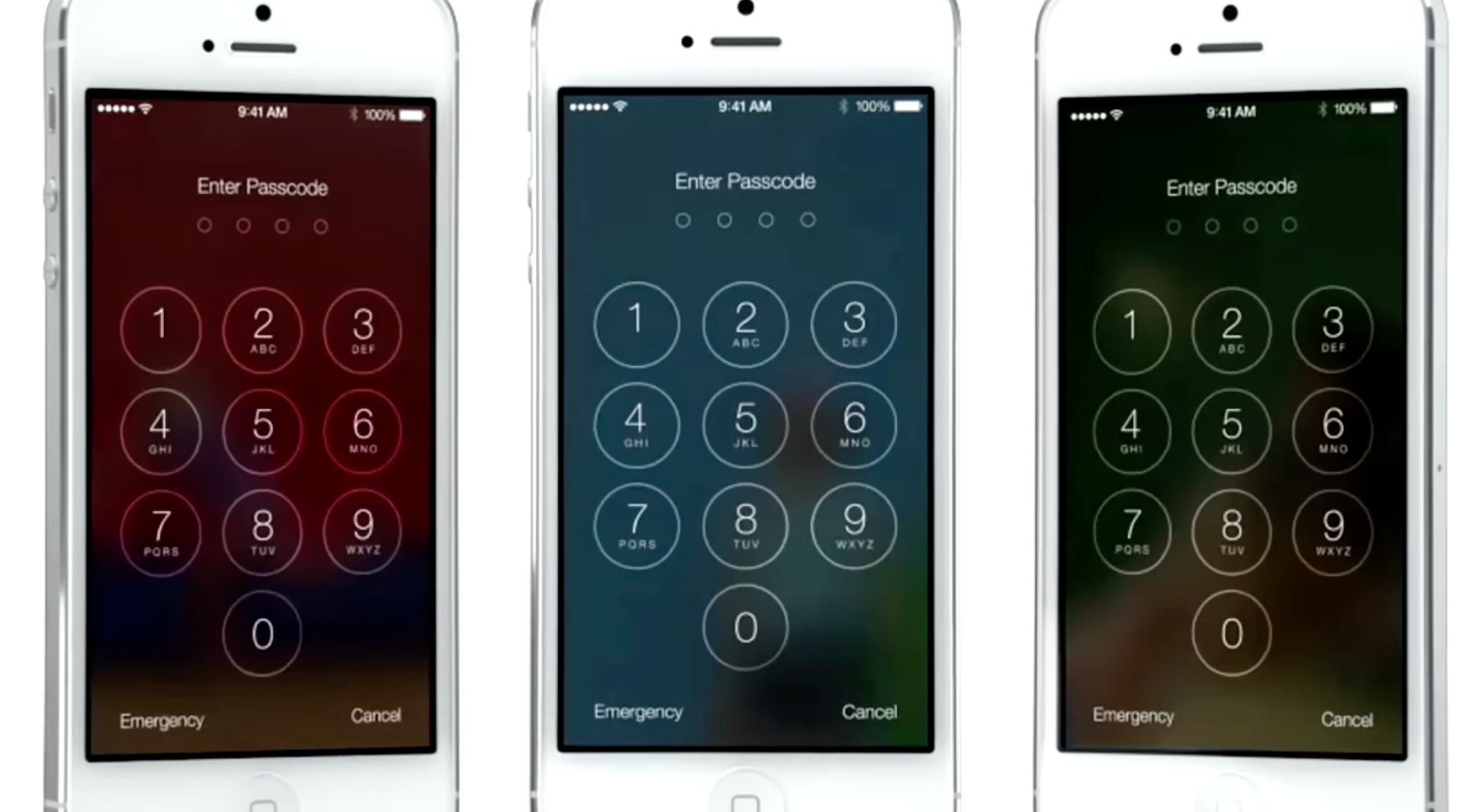
iOS 7 embraced a notion of distinct visual layers and using adaptive or dynamic effects to distinguish depth and separation. Why render flat highlights and shadows that are unresponsive to the actual environment of the user when you can separate the icons by rendering them on a separate plane from the background? Parallax made the icons ‘float’ distinctly above the wallpaper. The notification center sheet could simply be a frosted pane above the content which blurred its background for context.
Jony Ive proudly spoke at the iOS 7 introduction, on how ‘the simple act of setting a different wallpaper’ affected the appearance of many things. This was a very new thing.
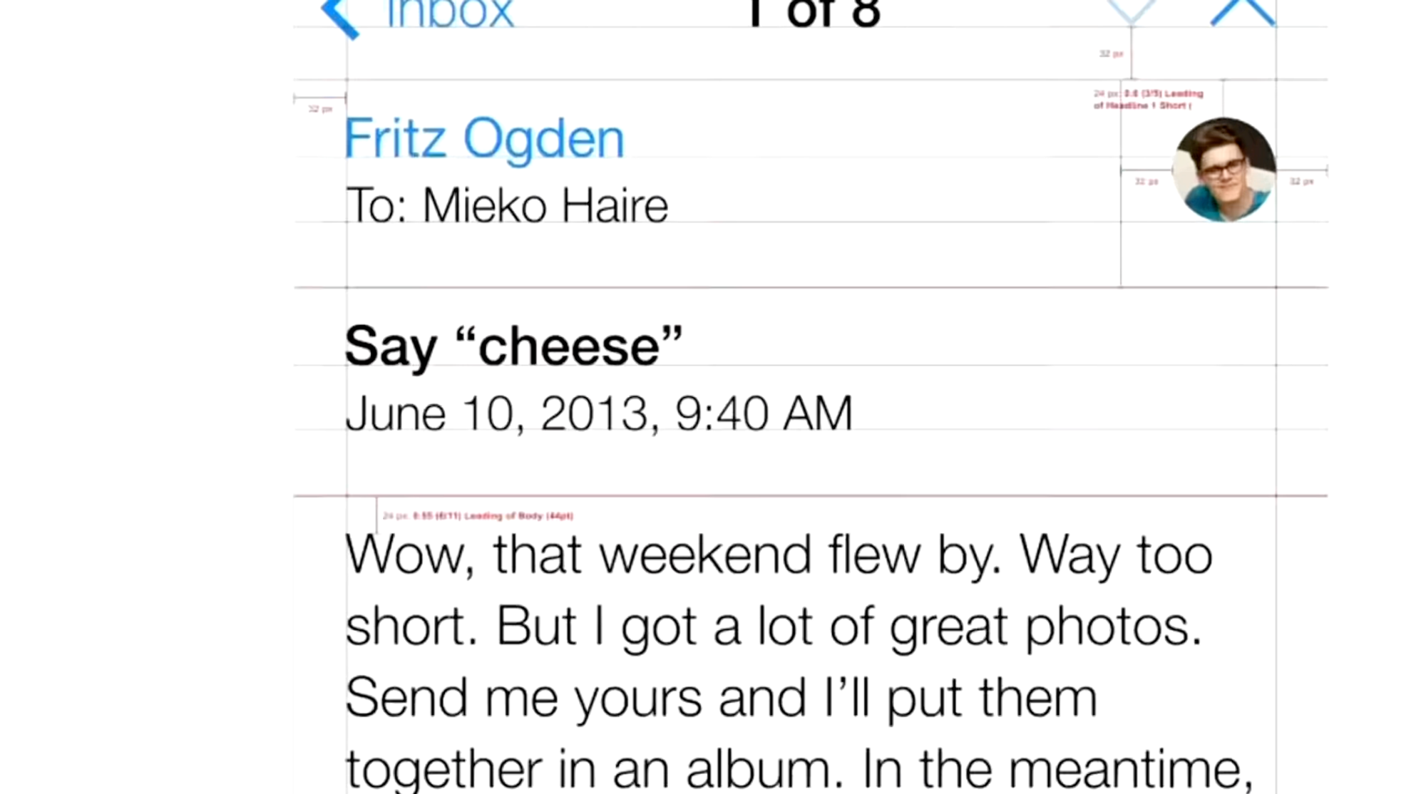
Also a new thing in the interface was that the UI chrome was able to have the same dynamics: things like the header and keyboard could show some of the content they obscured shining through as if fashioned out of frosted glass.
While it was arguably an overcorrection in some places, iOS 7’s radical changes were here to stay — with some of its dynamic ‘effects’ getting greatly reduced (parallax is now barely noticeable). Over time, its UI regained a lot more static effects.
Type and icons grew thicker, shadows came back, and colors became a lot less neon.
One of the major changes over time was that iOS got rounder; in step with the hardware it came on, with newly curved screen corners and ever-rounder iPhones, the user interface matched it in lock-step. It even did this dynamically based on what device it was running on.

More interface elements started to blend with content through different types of blur like the new progressive blur, and button shapes were slowly starting to make a comeback. It settled into a stable state — but it was also somewhat stagnant. For bigger changes, there would have to be a rethink.
What would come next couldn’t simply be a static bitmap again: it would have to continue the trend of increasingly adaptive interfaces.
The Age of Physicality
When Apple’s designers imagined the interface of VisionOS, they had a mandate to essentially start from scratch. What does an ‘app’ look like in an augmented reality?
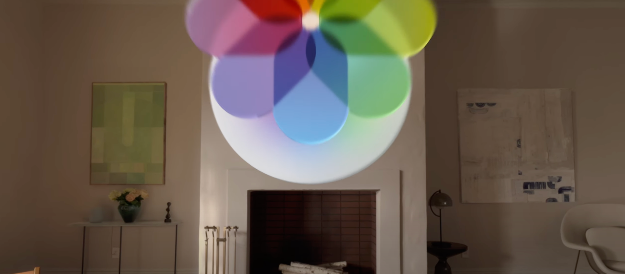
What appears to be a key foundational tenet of the VisionOS design language is how elements are always composed of ‘real’ materials. No flat panels of color and shapes exist as part of the interface.
This even applies to app icons: while they do have gradients of color, they occupy discrete layers of their own, with a clear intention from their introduction video of feeling like actual ‘materials’:
Alan Dye, upon introduction of the VisionOS interface, stated that every element was crafted to have a sense of physicality: they have dimension, respond dynamically to light, and cast shadows.
This is essential in Vision Pro because the interface of apps should feel like it can naturally occupy the world around you and have as much richness and texture as any of the objects that inhabit that space. Comparing to the interfaces we are familiar with, that paradigm shift is profound, and it makes older, non physicality-infused interfaces feel archaic.
If I were to position a regular interface in the Vision Pro context, the result looks almost comically bad:
I find it likely, then, that there will be more than a mere static visual style from visionOS brought to iPhone, iPad and Mac (and potential new platforms) — it seems likely that a set of new fundamental principles will underpin all of Apple’s styling across products and expressions of its brand.
It would have to be more subtle than on Vision Pro - after all, interfaces do not have to fit in with the ‘real world’ quite as much - but dynamic effects and behavior essentially make the interface come to life.
Sound familiar? Existing aspects of the iPhone user interface already do this:
Apple’s new additions to the iOS interface of the last years stand out as being materially different compared the rest of the interface.
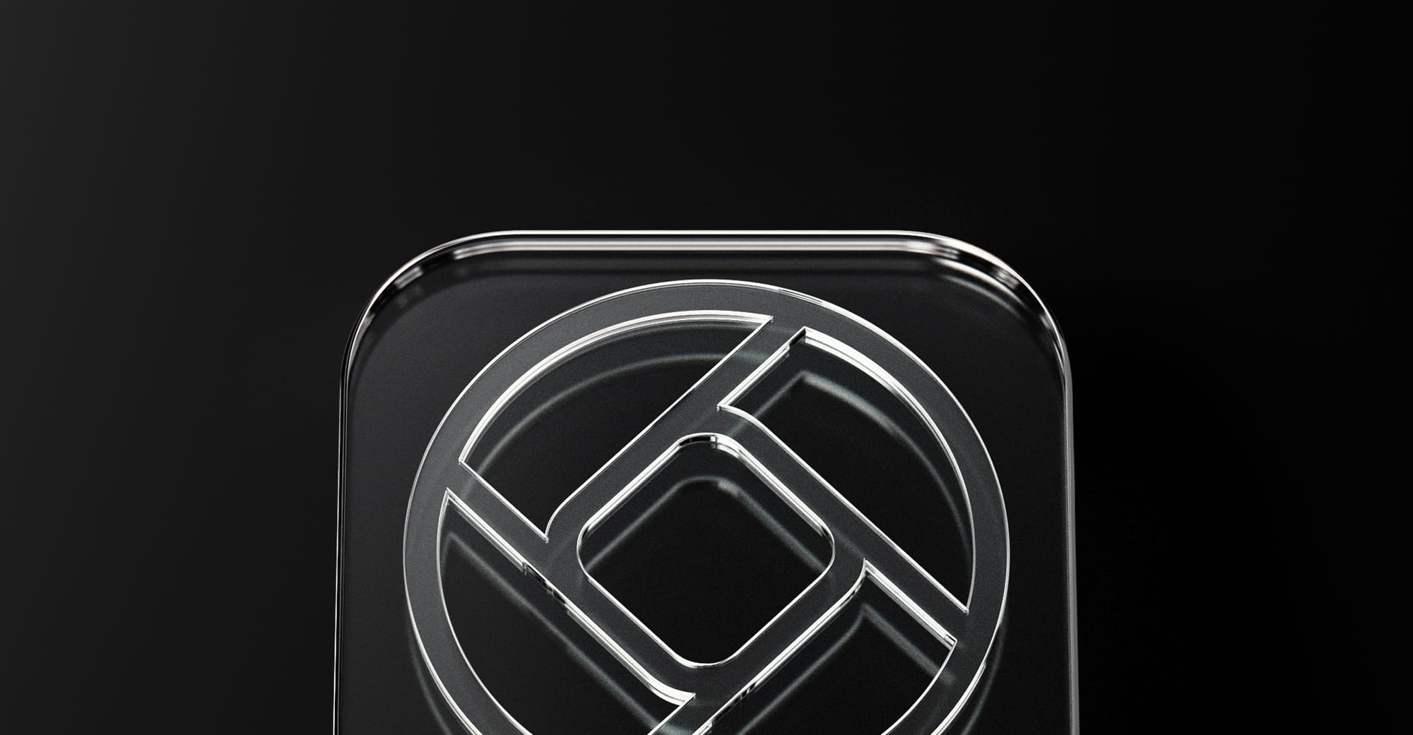
They are completely dynamic: inhabiting characteristics that are akin to actual materials and objects. We’ve come back, in a sense, to skeuomorphic interfaces — but this time not with a lacquer resembling a material. Instead, the interface is clear, graphic and behaves like things we know from the real world, or might exist in the world. This is what the new skeuomorphism is. It, too, is physicality.
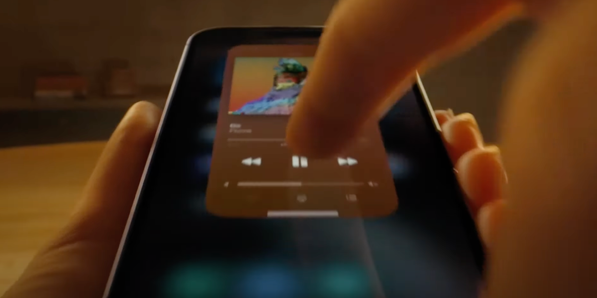
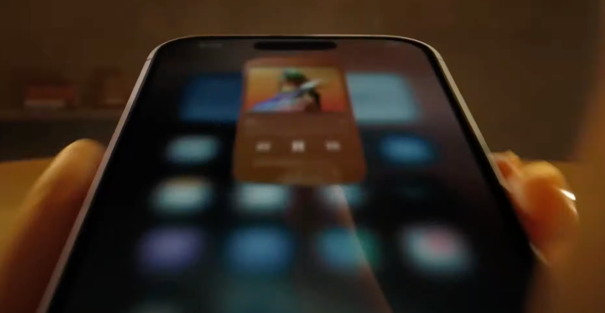
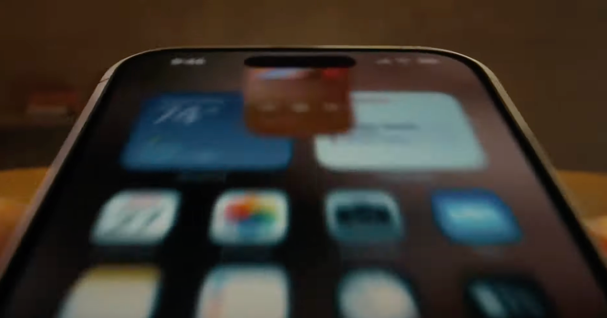
The Dynamic Island is a stark, graphic interface that behaves like an interactive, viscous liquid:
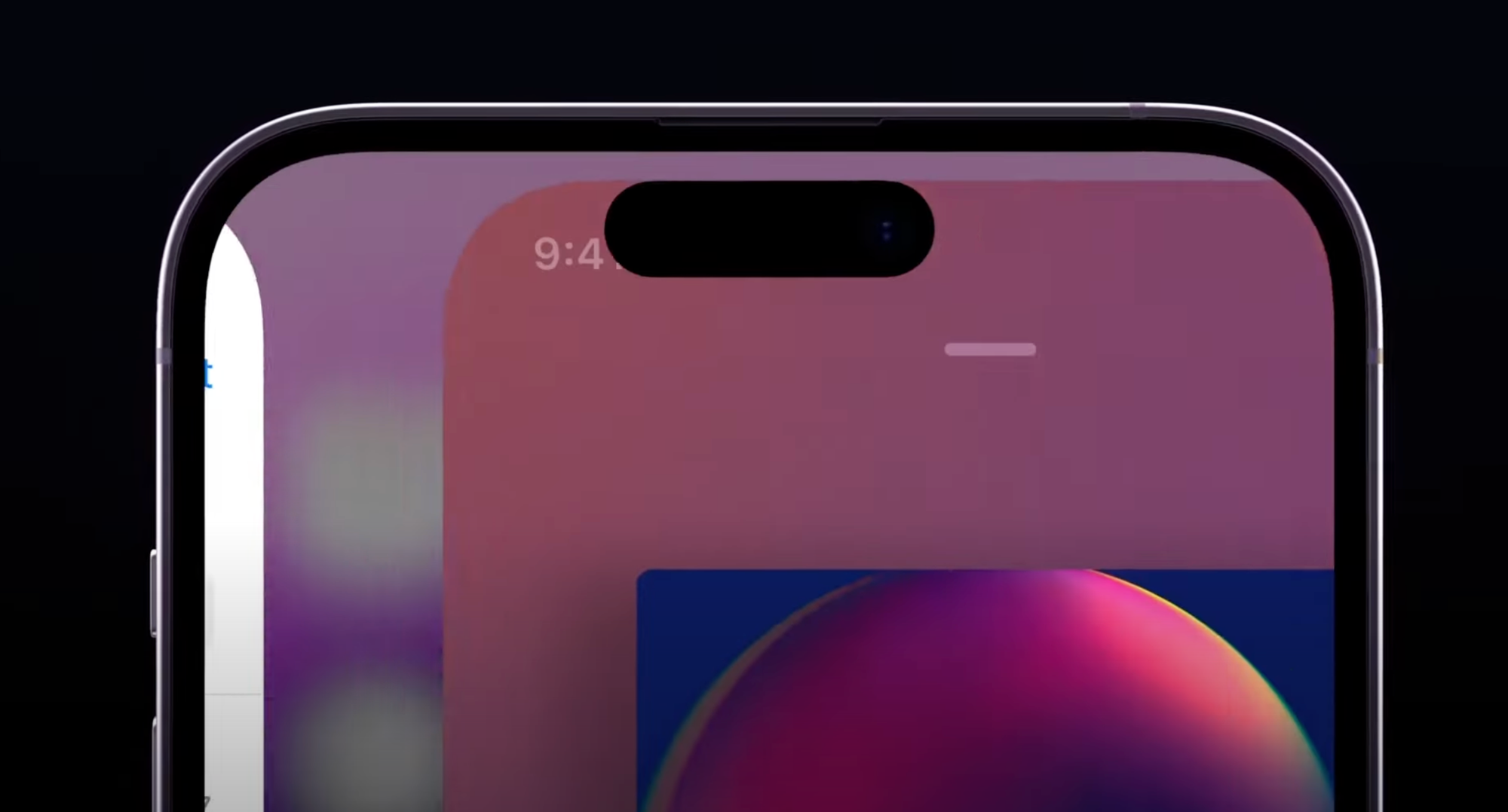
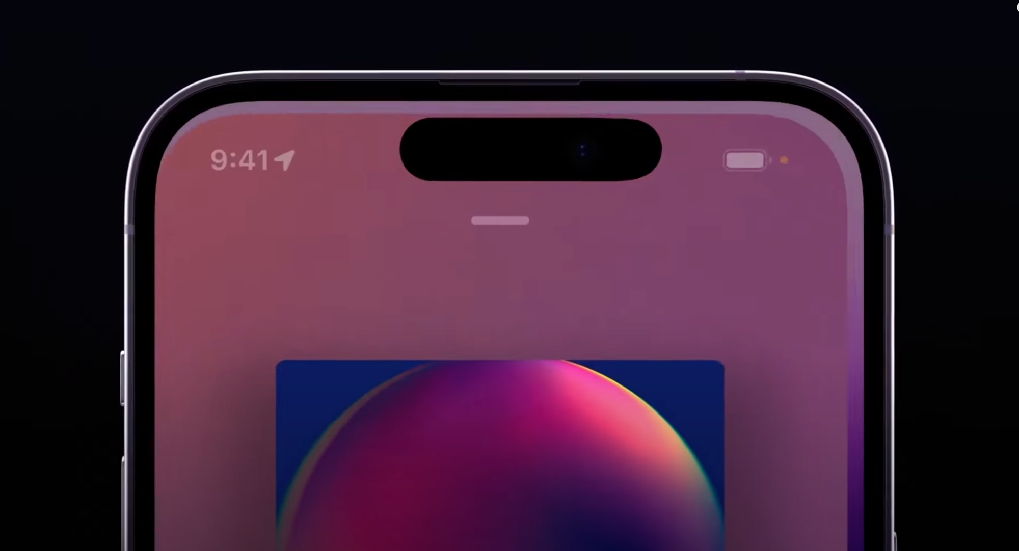
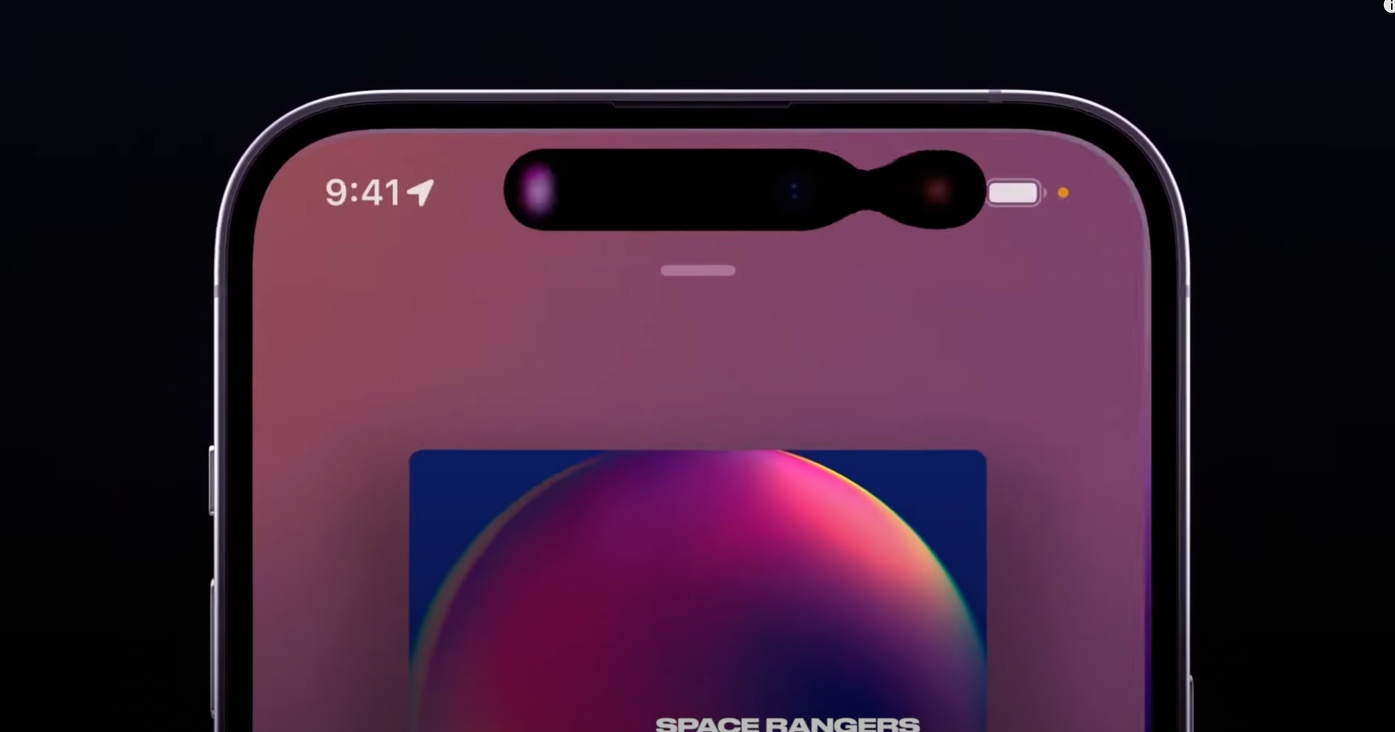
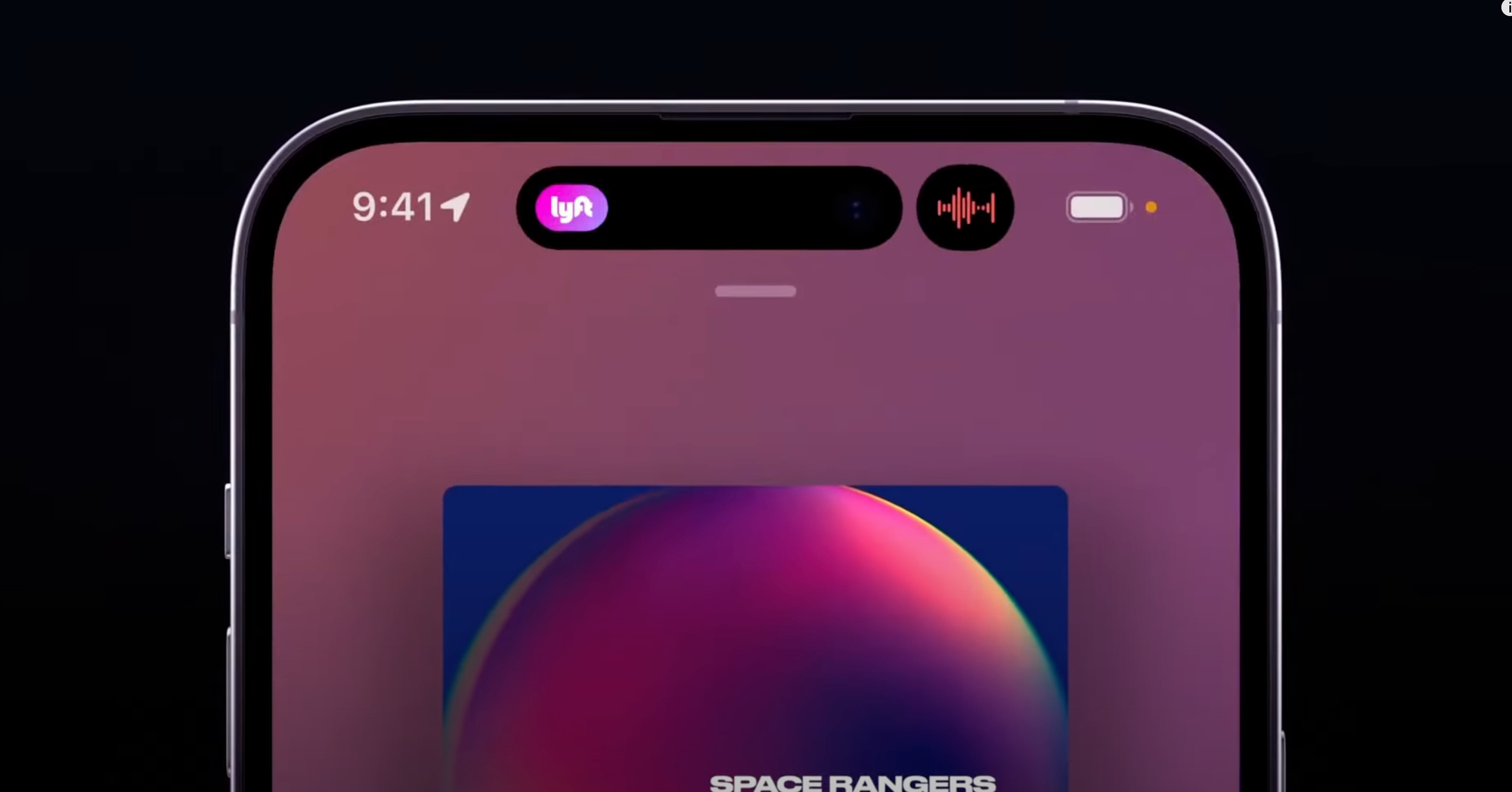
You can see it exhibiting qualities unique to its liquid material, like surface tension, as parts of it come into contact and meld together.
When it gains speed, it has momentum, much like the scrolling lists of the very first iteration of iPhoneOS, but now it reads more realistic to us as it also has directional motion blur or a plane of focus as items move on their plane:
Similarly, the new Siri animation behaves a bit more like a physically embodied glow - like a fiery gas or mist that is attracted to the edges of the device and is emitted by the user’s button press or voice.
What could be the next step?
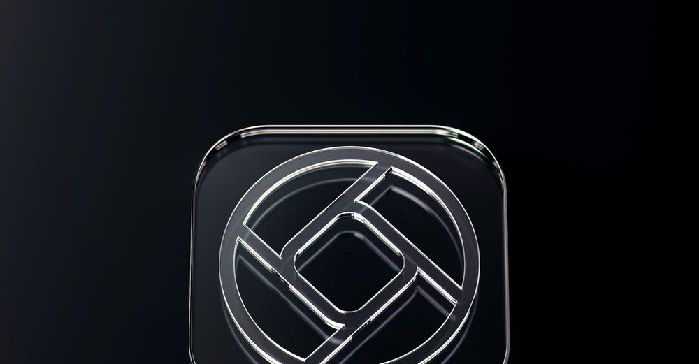
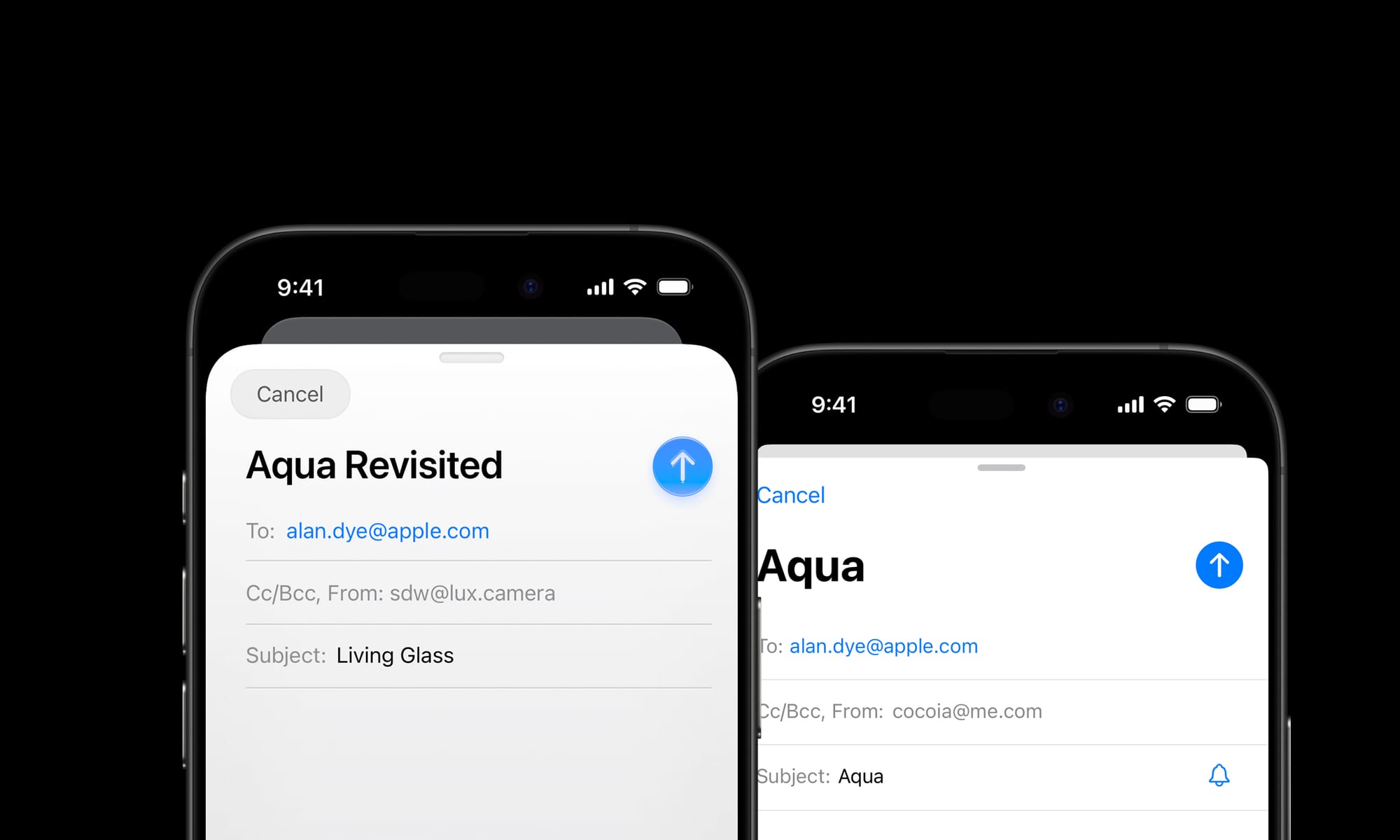
My take on the New Age: Living Glass
I'd like to imagine what could come next. Both by rendering some UI design of my own, and by thinking out what the philosophy of the New Age could be.
A logical next step could be extending physicality to the entirety of the interface. We do not have to go overboard in such treatments, but we can now have the interface inhabit a sense of tactile realism.
Philosophically, if I was Apple, I’d describe this as finally having an interface that matches the beautiful material properties of its devices. All the surfaces of your devices have glass screens. This brings an interface of a matching material, giving the user a feeling of the glass itself coming alive.
VisionOS details from the excellent Wallpaper interview with Apple’s design team.
Buttons and other UI elements themselves can get a system-handled treatment much like visionOS handles window treatments.*
*VisionOS is an exceptionally interesting platform, visual effect-wise, as the operating system gets very little data from the device cameras to ensure privacy and security. I would imagine that the “R1” chip, which handles passthrough and camera feeds, composes the glass-like visual effects on the UI chrome. All Apple devices can do this: they already do system-level effect composition for things like background blurs.
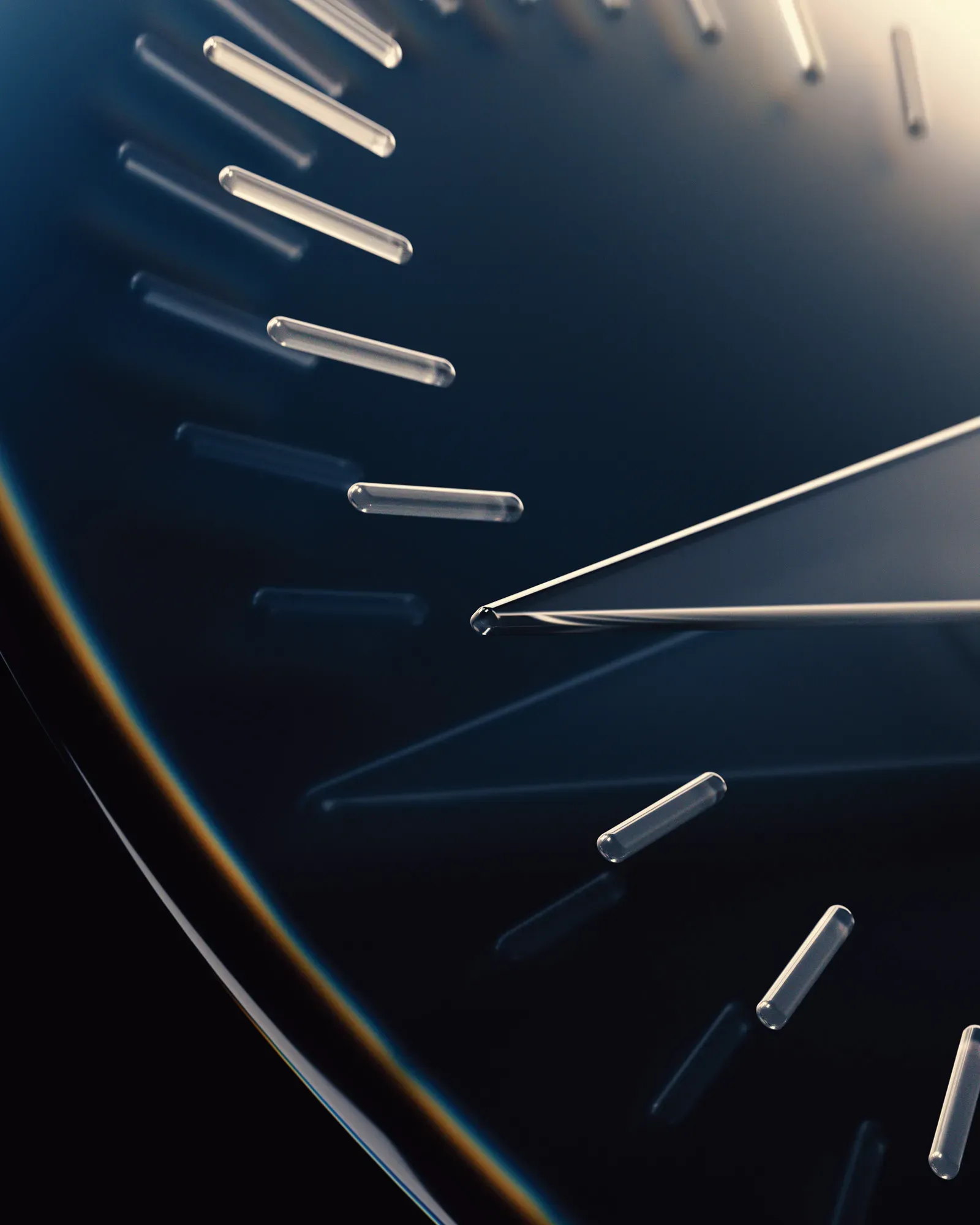
I took some time to design and theorize what this would look like, and how it would work. For the New Design Language, it makes sense that just like on VisionOS, the material of interactivity is glass:
Glass is affected by its environment. The environment being your content, its UI context, and more.
Since it is reflective, it can reflect what is around it; very bright highlights in content like photos and videos can even be rendered as HDR highlights on Glass elements:
Glass elements visibly occupy a place in a distinct spatial hierarchy; if it does not, elements can be ‘inlaid’: in essence, part of the plane of glass that is your display or a glass layer of the UI:
Much like the rear of your iPhone being a frosted pane of glass with a glossy Apple logo, controls or elements can get a different material treatment or color. Perhaps that treatment is even reactive to other elements in the interface emitting light or the device orientation — with the light on it slightly shifting, the way the elements do on VisionOS when looked at.
Controls may transition as they begin to overlay content. One can imagine animated states for button lifting and emerging from their backdrop as it transitions the hierarchy:
These effects can be rendered subtly and dynamically by the system. In comparison, it makes ‘regular’ static interfaces look and feel inert and devoid of life.
Glass has distinct qualities that are wonderful in separating it from content. It can blur the material below it, as we already see in modern iOS controls. It can have distinct, dynamic specular highlights from its surroundings:
It can have caustics, which is to say it separates itself from the backdrop by showing interaction with light in its environment by casting light, not shadow:
... and it can also get infused with the color and theme of the interface around it. Glass does not just blur or refract its background: it reflects, too. This isn’t totally out of left field: this is seen in the WWDC25 graphics, as well:
Elements of Style
Having a set of treatments established, let’s look at the elements of the New iOS Design.
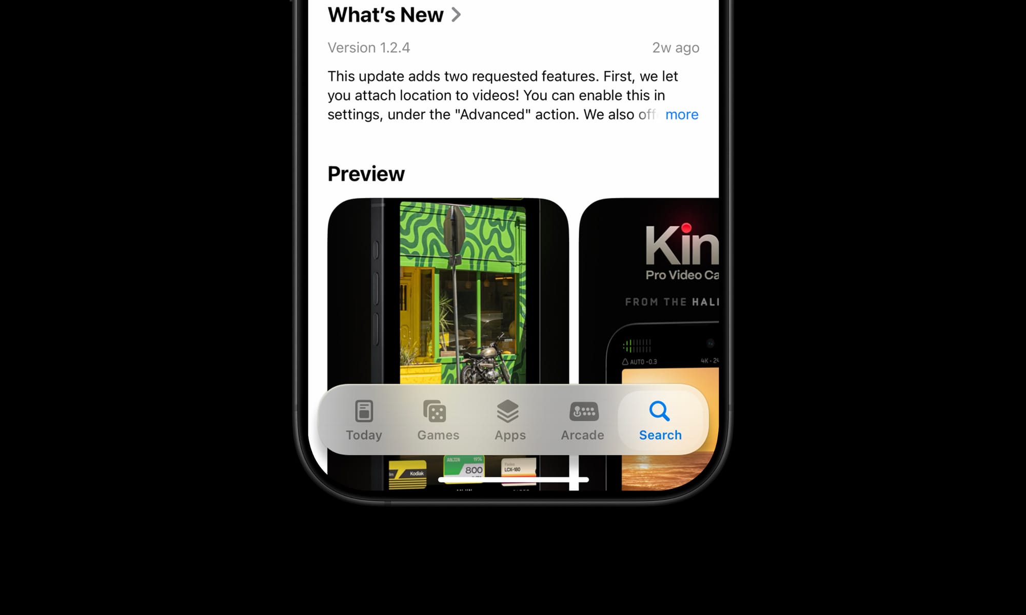
Tab Bar
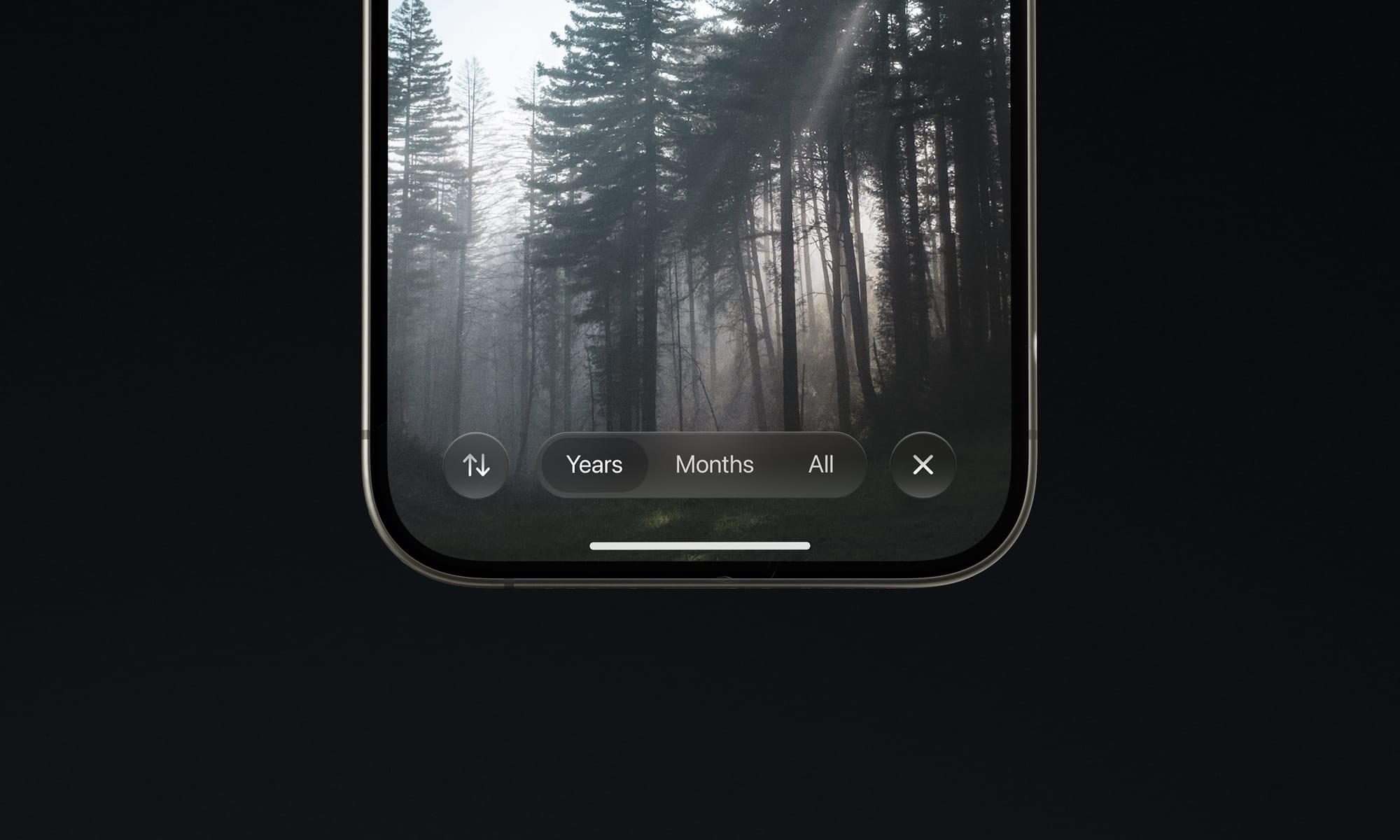
I would imagine that the era of ‘closed tab bars’, that is, the type that masks the content outright is ending. In fact, I wouldn’t be surprised if almost all UI that outright masks the interface like that as a max-width bar would be gone.
These types of static interface panels are a legacy element from the early days of iOS. The new type can float over content:
Controls like this are better suited to transition to rise from its underlying ‘pane’ as you scroll it out of view, and can similarly also hide themselves so they're not obscuring content all the time.
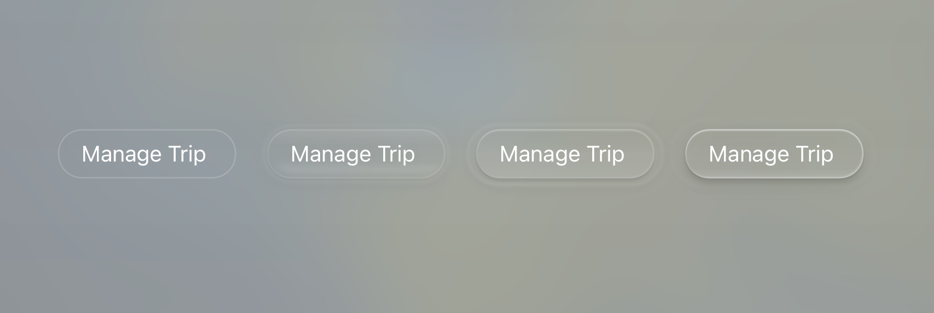
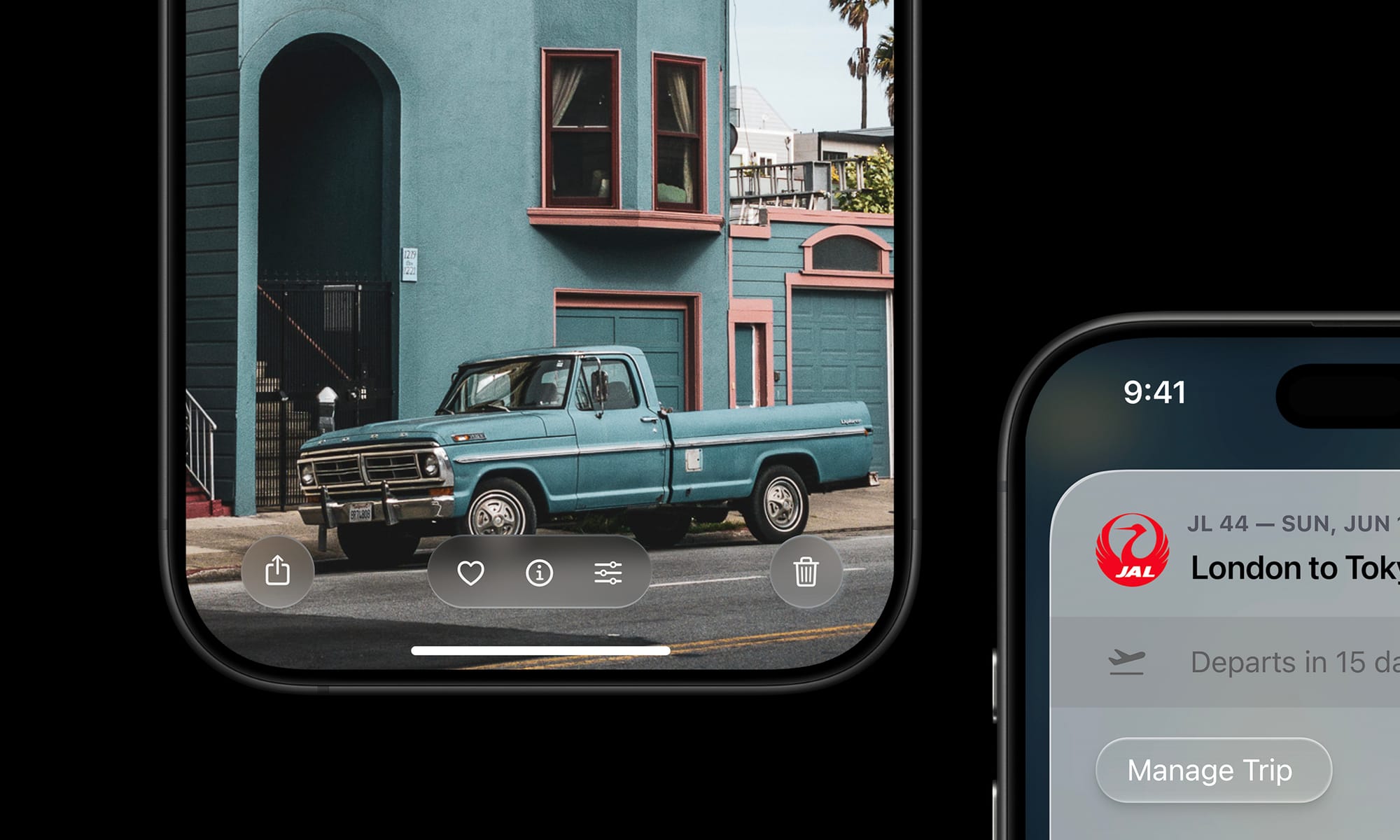
Controls
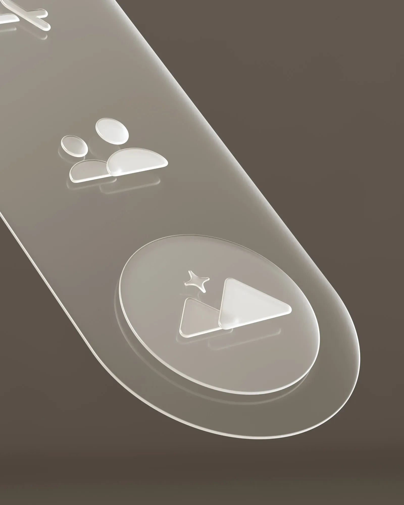
It can be overwhelming for all elements in the interface to have a particularly rich treatment, so as I mentioned before, I would expect there to be various levels of this ‘depth’ applied. Core actions like the email sending button in Mail can be elevated:
Whereas other actions that are part of the same surface — like the ‘Cancel’ action here — can get more subtle treatments.
Elevated controls can be biased slightly towards warmer color balance and background elements towards cool to emphasize depth.
App Icons
Apple put considerable work into automatic masking for icons in iOS 18, and I doubt it was only for Dark Mode or tinted icons on an identical black gradient icon backdrop. The simple, dark treatment of icon backgrounds makes me imagine it was preparation for a more dynamic material backdrop.
Not to mention, app icons are exactly the type of interactive, raised element I spoke of before that would be suited to a living glass treatment.
I’d also imagine some app icons that are due for a redesign would get updates. Many haven’t been updated since iOS 7. This would be a major change to some of Apple’s ‘core brands’, so I expect it to be significant, but consistent with the outgoing icons to maintain continuity while embracing the new visual language —kind of like the Safari icon above.
On the note of icons, I also wouldn’t be surprised if the system icons themselves got a little rounder.
Home Screen
It seems likely the Home Screen as a whole is re-thought for the first time. Its complexity has ballooned since the early days of iOS. I find myself spending a lot of time searching in my App Library.
I think there’s a great AI-first, contextual slide-over screen that can co-exist with the regular grid of apps we are used to. I was a bit too short on time to mock this up.
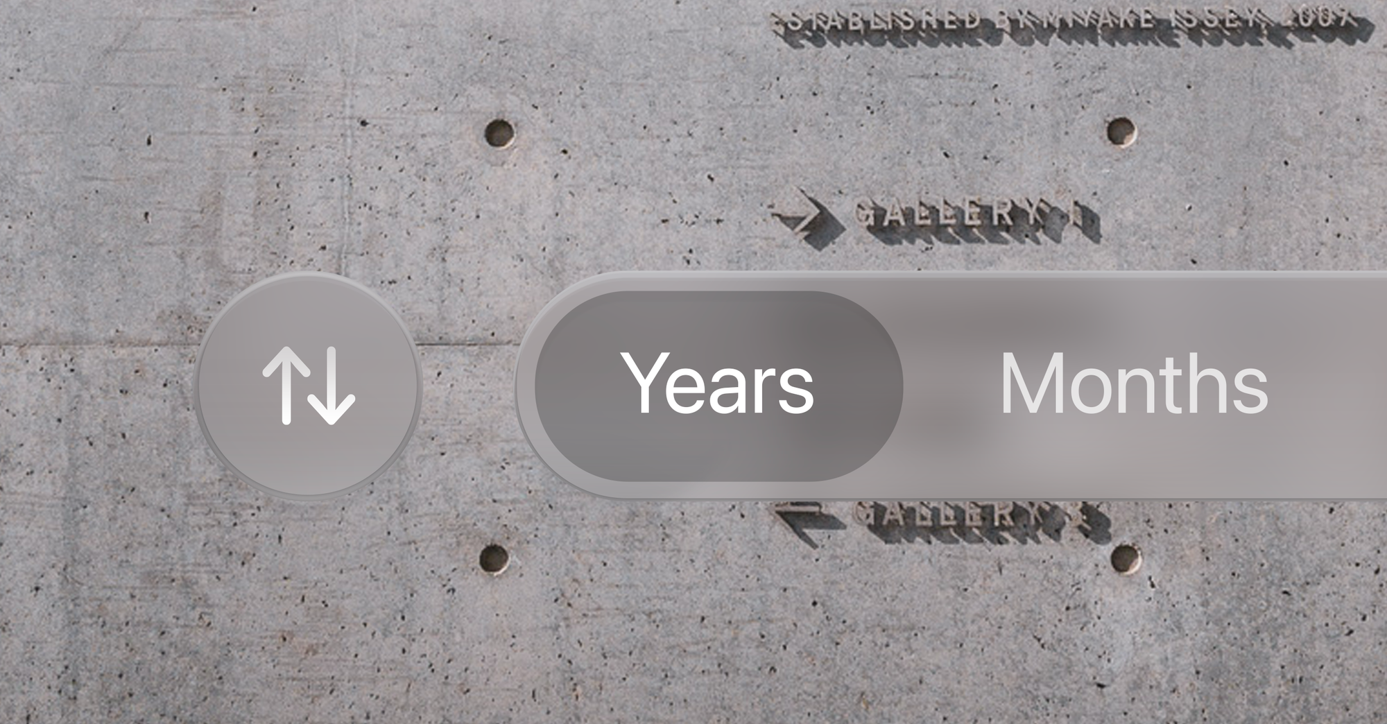
Sliders and Platters
Basic interactive building blocks of the iOS interface will get system-provided treatments that are responsive to their environment:
Overall, one can imagine a rounding and softening of the interface through translucent materials looking pretty great.
Beyond
This ‘simple’ change in treatment — to a dynamic, glassy look — has far-reaching consequences.
Apple is unique — its predominant user interface style in the 2000s has always been linked to its branding. Its icons are also logos, its treatments a motif that stretch far beyond platforms they live on. Consider the navigation of Apple.com:
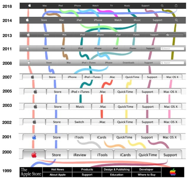
It is not a stretch to assume that this, too, would assume some kind of dynamic, new style. Therein lie some of the challenges.
I love products with innovative, novel interfaces — modern iOS isn’t a simply a product, but a platform. Its designers bear responsibility to make the system look good even in uncontrolled situations where third party developers like myself come up with new, unforeseen ideas. That leaves us with the question of how we can embrace a new, more complex design paradigm for interfaces.
A great thing that could come from this is new design tools for an era of designing interfaces that go so far beyond placing series of rounded rectangles and applying highly limited effects.
When I spoke of designing fun, odd interfaces in the ‘old days’, this was mostly done in Photoshop. Not because it was made for UI design — quite the contrary. It just allowed enough creative freedom to design anything from a collection of simple buttons to a green felt craps table.
If what is announced is similar to what I just theorized, it’s the beginning of a big shift. As interfaces evolve with our more ambient sense of computing and are infused with more dynamic elements, they can finally feel grounded in the world we are familiar with. Opaque, inert and obstructive elements might occupy the same place as full-screen command line interfaces — a powerful niche UI that was a marker in history, passed on by the windowed environment of the multi-tasking, graphical user interface revolution.
Science Fiction and Glass Fiction
The interfaces of computers of the future are often surprisingly easy to imagine. We often think of them and feature them in fiction ahead of their existence: our iPhone resembles a modern Star Trek tricorder; many modern AI applications resemble the devices in sci-fi movies like ‘Her’ and (depressingly) Blade Runner 2049. It’s not surprising, then, that concept interfaces from the likes of Microsoft often feature ‘glass fiction’:
It’s a beautiful, whimsical UI. Unfortunately, it only exists in the fictional universe of Microsoft’s ads.
The actual interface is unfortunately not nearly as inspired with such life and behavioral qualities. The reason is simple: not only is the cool living glass of the video way over the top in some places, but few companies can actually dedicate significant effort towards creating a hardware-to-software integrated rendering pipeline to enable such UI innovations.
Regardless, we like to imagine our interfaces being infused with this much life and joy. The world around us is — but our software interfaces have remained essentially lifeless.
And that brings us to Apple. There was an occasion or two where Apple announced something particularly special, and they took a beat on stage to pause and explain that only Apple could do something like this. It is a special marriage of hardware, and software — of design, and engineering. Of technology and the liberal arts.
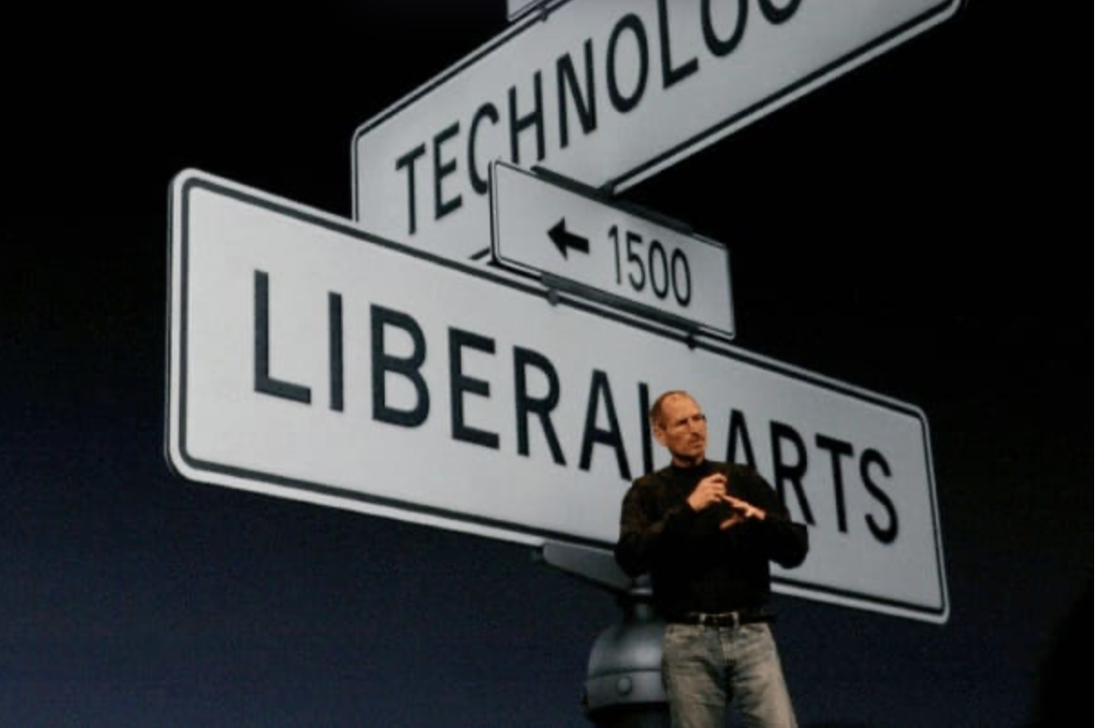
And that still happens today. Only Apple could integrate sub pixel antialiasing and never-interrupted animations on a hardware level to enable the Dynamic Island and gestural multi-tasking; only Apple can integrate two operating systems on two chips on Vision Pro so they can composite the dynamic materials of the VisionOS UI. And, perhaps only Apple can push the state of the art to a new interface that brings the glass of your screen to life.
We’ll see at WWDC. But myself, I am hoping for the kind of well-thought out and inspired design and engineering that only Apple can deliver.
All writing, conceptual UI design and iconography in this post was made by hand by me. No artificial intelligence was used in authoring any of it.